From Blank to Bold — The Emotional Reset of Colour
For decades, white and pastel tones dominated home interiors.
They symbolized space, purity, minimalism — the idea that simplicity was sophistication.
But in recent years, something changed. Homes began to darken — softly, beautifully.
Deep blues started to appear — navy, midnight, cobalt, smoke — tones once reserved for art galleries and hotel lounges now glow in the heart of people’s living rooms.
This shift isn’t just visual. It’s psychological — a reaction to restlessness, overstimulation, and a digital world that never stops glowing.
“People are craving depth, not brightness,” says interior designer Richa Bahl.
“Blue brings that — it absorbs light, steadies emotion, and makes a room feel like it’s breathing.”
Architectural Psychology — When Colour Shapes Calm
Architects and designers often say that space isn’t just built — it’s felt.
And colour, more than any other element, defines that feeling.
- White walls represent openness and possibility, but they also create emotional distance.
- Deep blue walls, on the other hand, create containment — a sense of safety, enclosure, and intimacy.
In architectural terms, this is called cocooning — designing spaces that comfort the mind as much as they impress the eye.
After the pandemic years, where homes became sanctuaries, people began seeking colours that embraced, not exposed, them.
Blue — the colour of dusk, depth, and reflection — became the perfect answer.
The Colour of Stillness — What Blue Means
Psychologically, blue is the colour of trust, stability, and calm.
It slows the heart rate, softens mood, and deepens focus.
That’s why it’s used in corporate branding, meditation rooms, and even hospitals.
But when applied in darker tones to a living space, it transforms into something more poetic:
it evokes quiet confidence.
“Blue is the world’s favourite colour for a reason,” says colour theorist Leatrice Eiseman.
“It reminds us of the sky, the sea, and the infinite — things larger than ourselves but deeply familiar.”
So while pastels spoke of perfection, deep blue speaks of peace.
It’s less about display, more about depth — a shift from aesthetic beauty to emotional belonging.
Cultural Resonance — The Return of Soulful Spaces
Historically, blue has carried multiple meanings across cultures.
- In ancient Egypt, it symbolized protection and eternity.
- In Greece, it was believed to ward off evil spirits.
- In India, Lord Krishna and Shiva — embodiments of compassion and vastness — are portrayed in shades of deep blue.
So, when modern homes choose blue today, perhaps unconsciously, they echo that same timeless yearning:
for serenity amid chaos, for beauty rooted in soul.
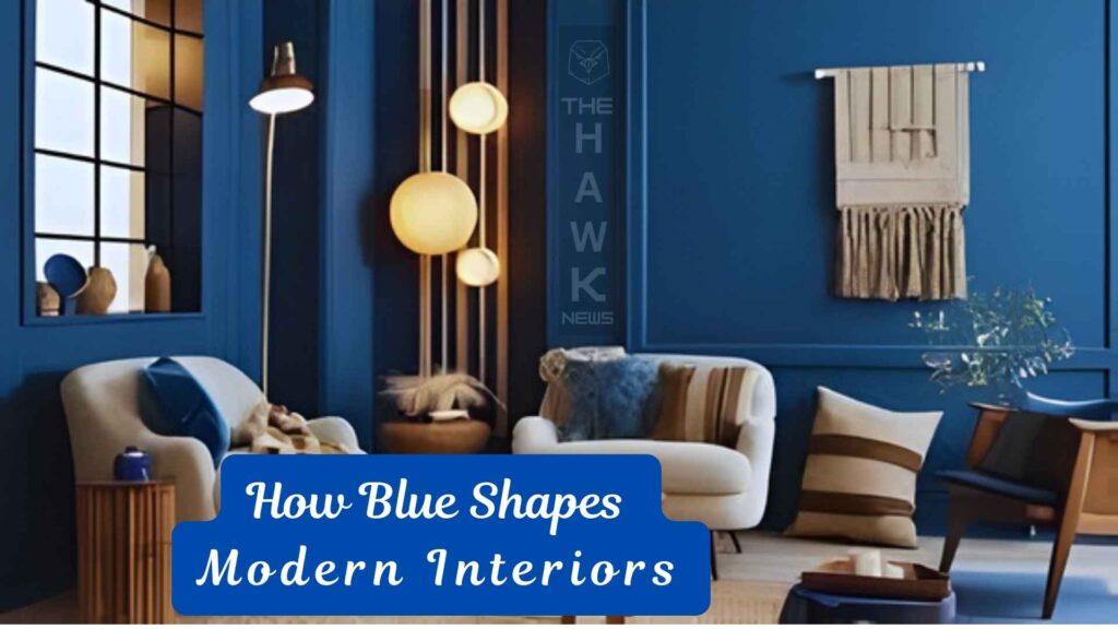
Design Language — How Blue Shapes Modern Interiors
Architecturally, dark walls once meant a risk — they absorb light, shrink perception.
But new design philosophies, supported by better lighting, matte finishes, and warm textures, have turned them into modern elegance.
Deep blue pairs naturally with brass, wood, stone, and linen — materials that carry warmth.
It invites balance:
- A navy wall with beige or oak accents.
- A cobalt wall against gold lighting.
- Midnight blue softened by pale cushions or muted art.
This interplay of dark and light creates depth and drama without aggression — a sophistication that feels lived-in, not staged.
The Sociological Underpinning — Why Now
This blue movement isn’t just design — it’s emotional recovery.
After years of uncertainty, people are turning inward — toward self, toward reflection, toward silence.
The white minimalism that once represented freedom now feels sterile to many.
Blue, by contrast, feels alive yet grounded.
It’s not a colour of retreat — it’s a colour of renewal.
“Blue gives people permission to rest,” says architect Thomas Heatherwick.
“It’s not passive. It’s patient.”
A Deeper Truth — Colour as Emotional Architecture
If white was the language of ambition, blue is the language of introspection.
It tells us that beauty doesn’t have to be loud, that peace can have colour, that the home is no longer a showroom — it’s a sanctuary.
Every shade of blue — from the twilight of navy to the ink of midnight — carries a quiet reminder:
we’ve lived through too much brightness; now we long for depth.
And in that longing, perhaps we’ve discovered something timeless:
that colour, like the soul, finds balance not in light or darkness — but in harmony between the two.